
Brand identity, packaging & communication
Surpassion
From an emblem to a complete visual language.
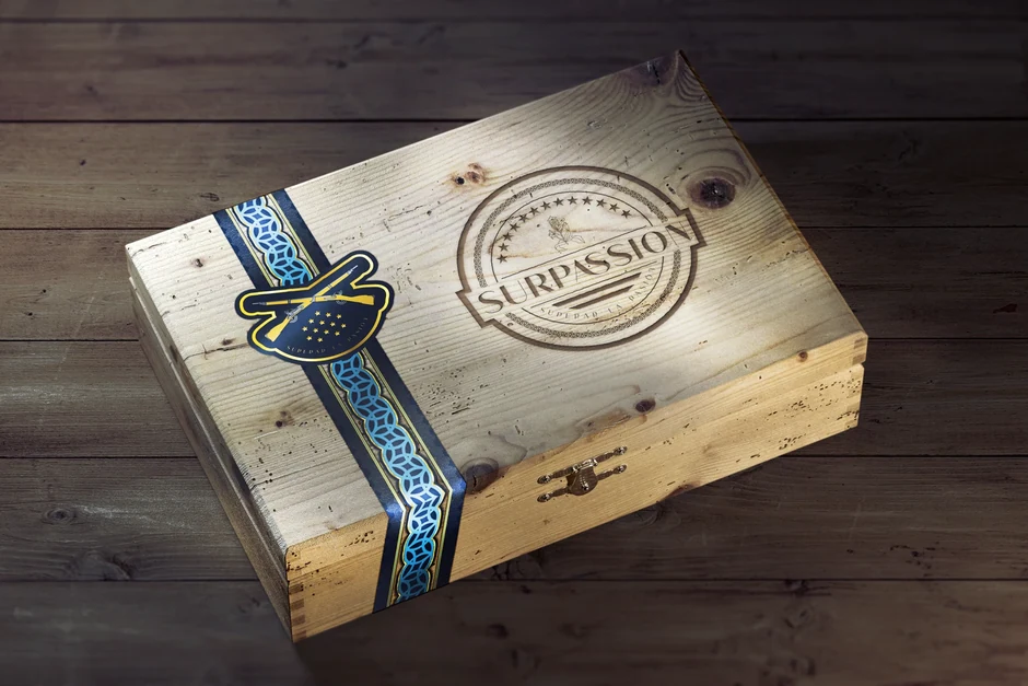
Surpassion began with a founder’s personal history and a brief shaped by military dress, ceremonial symbols and botanical imagery. Miradore developed the logo, packaging and brand communication around those references. The project archive brings together the emblem, original pattern artwork, packaging layouts, communication designs and a photograph of the printed identity in production.
- Logo & brand identity
- Packaging design
- Brand communication
01 / THE ORIGIN
A name with a history.
The founder’s account traces the idea to his military service in Iraq in 2003 and subsequent work as a retail tobacconist. The name combines “Surpass” and “Passion”; the original brief pairs it with the Spanish phrase “Superar la pasión.” That personal history gave the identity project its starting point.
02 / THE DESIGN REFERENCES
From service to symbolism.
The brief referenced US Army dress blues, ceremonial insignia and the infantry cord, with Bluebird blue specified as a starting colour. It also called for tobacco leaves and flowers in the band design. Miradore’s artwork brings these references into a circular emblem, botanical linework and a palette of blue and gold.
03 / PACKAGING & COMMUNICATION
From the brief to the box.
A stamped wooden box and a cord-inspired band were proposed in the original brief. The packaging artwork below shows how the identity was arranged across the lid, interior and side panels. Communication layouts carry the same typography and botanical pattern into different compositions, while a production photograph records the printed identity being applied by hand.